I built and executed the strategic plan that took madison.com from an under-used domain name to the number one newspaper website in the country. This campaign won many awards and put madison.com on the map.
The success of the campaign was based on the brand development process I created and led that positioned madison.com as the cheerleader for the City of Madison. We did this by employing classic propaganda art, which was not only bold and eye-catching, but also consistent with the politics of the "Berkeley of the Midwest."
Like all of the work my teams produce, every element of the design had a purpose:
- Circle star represented Madison, as the capital of Wisconsin
- Every image included a Madison landmark
- Badger red symbolized the mascot and school color for UW-Madison
- Bold line contour illustrated the strength of the locals
- Viewpoint of the subject was designed for the people to tower and be the focal point
- Tattered corners simulated underground artwork posted on local kiosks and telephone poles
- Headline was limited to one, bold word
The ultimate purpose of the campaign was to make people proud of their city. The campaign was so popular that we fielded many requests for poster art, it won many awards, and established the site as a revenue source.
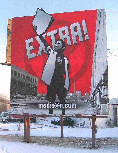
This artwork stood at the most-traveled point of the Madison beltline highway. It tied together the idea that madison.com was the online home of the local newspapers.

The first iteration to feature a sub domain of the site.

The first ad of the campaign - utilizing the state slogan.

This was designed to tie the newspapers to the site.
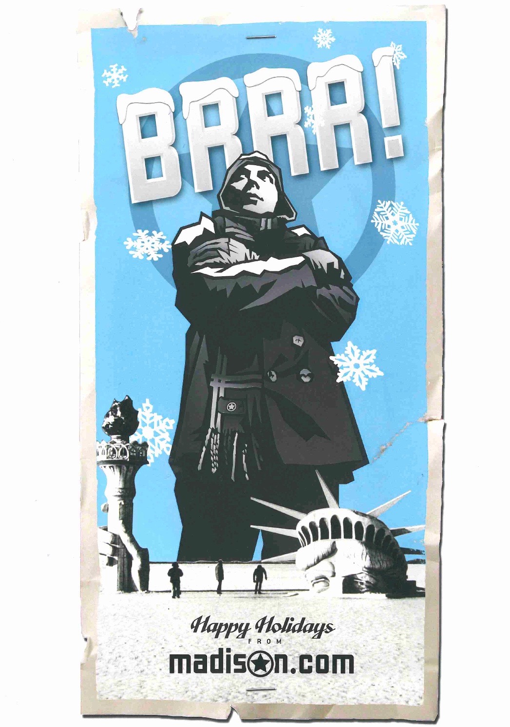
Winter holiday artwork, as the campaign started expanding and utilizing different color schemes.
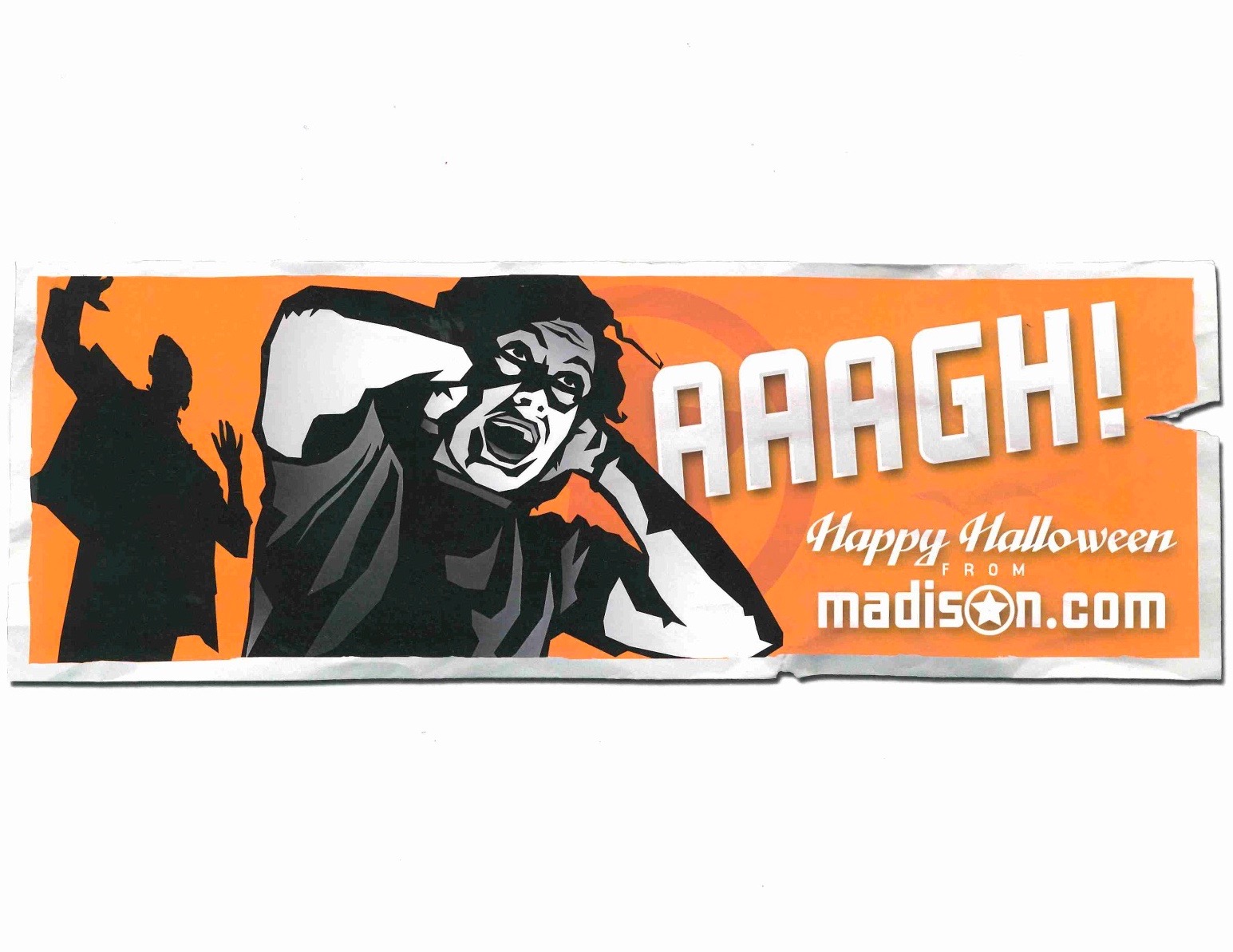
Halloween artwork.

An experimental version - the only one that did not feature a local person or landmark.

Valentine's Day artwork.
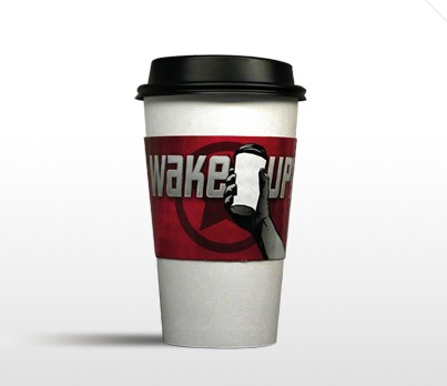
An example of the viral component of the campaign, this appeared in local coffee shops. There were also magnetic "circle stars" that people stuck all over the city. We made them magnetic to prevent property damage.

We started aggressively supporting local music to appeal to Madison's college audience. We became the most-used news source in the 18-35 target audience.

This was madison.com when I started working there. While the domain was madison.com, they referred to it as "Most on Madison."

The site has undergone many iterations, but this was one of the first after we reinvigorated the brand and tied it to the campaign.